Introduction to Spot Diagrams
As optical engineers, we use different tools and techniques to evaluate the performance of an optical design when simulating the system in a ray tracing program. One of those tools are spot diagrams. They may be a little bit confusing to use at first but are an excellent way to communicate the quality of an optical system.
Let’s say we have an optical imaging system. We want that system to reproduce an image as closely as possible to the real object. A spot diagram shows the image produced by an optical system assuming that the object is a spot of light. It provides a quick visual evaluation of the optical system’s quality. Deformations of the image caused by different aberrations such as astigmatism, coma, spherical aberration, chromatic aberration, and more can be instantly viewed.
Spot diagrams are a graphical tool used to evaluate the image quality of an optical system. They are commonly used in the field of optics to evaluate the performance of lenses, telescopes, microscopes, and other optical devices.
Spot diagrams are created by tracing a bundle of rays from an object through an optical system and then plotting the position of each ray on a diagram. The diagram typically consists of a grid that represents the image plane of the optical system, and each ray is represented by a point on the grid.
The position of each point on the diagram represents the location where the corresponding ray intersects the image plane. The size and shape of each point represent the size and shape of the spot that would be produced on the image plane by that ray. By analyzing the distribution of spots on the diagram, it is possible to evaluate the image quality of the optical system.
Spot diagrams can be used to evaluate a wide range of optical properties, including chromatic aberration, spherical aberration, coma, astigmatism, and distortion. They are a powerful tool for optimizing optical system design and for identifying and correcting problems in existing systems.
Fundamentals of Spot Diagrams
Spot diagrams are created through a systematic process that involves tracing rays of light through an optical system to visually represent the impact of aberrations on image formation. The generation of spot diagrams provides valuable insights into the optical quality of a system, allowing designers to assess and optimize its performance. Here’s a step-by-step overview of how spot diagrams are created:
- Selection of Object Points: The process begins with the selection of representative object points. These points are strategically chosen to assess the performance of the optical system across the field of view. Typically, chief rays (rays passing through the center of the aperture stop), marginal rays (rays passing through the edge of the aperture stop), and rays from critical object points are traced.
- Ray Tracing: Each selected ray is traced through the optical system from the object plane to the image plane. The trajectory of each ray is influenced by the optical elements, including lenses and mirrors, and the impact of aberrations present in the system.
- Image Formation: The rays converge onto the image plane, forming a spot corresponding to each traced ray. In an ideal optical system, all rays from a single object point would converge to a single point on the image plane, resulting in a sharp and well-defined spot. However, aberrations in the system introduce deviations in the paths of the rays, leading to the formation of distorted or blurred spots.
- Spot Diagram Presentation: The spots formed by the converging rays are plotted on a diagram, typically using a grid that represents the image plane. Each spot represents the image point corresponding to the traced ray. The size, shape, and distribution of the spots provide a visual indication of the aberrations present in the optical system.
- Analysis and Optimization: Optical designers analyze the spot diagram to assess the impact of aberrations on image quality. Sharp and focused spots indicate minimal aberrations, while spread-out or distorted spots reveal specific optical imperfections. This analysis guides designers in refining and optimizing the system, whether by adjusting lens parameters, introducing corrective elements, or employing other optical design strategies.
- Iterative Design Process: Spot diagrams are integral to the iterative design process. Designers use the insights gained from spot diagrams to refine the optical system, reducing aberrations and improving image quality. This iterative cycle continues until the desired level of optical performance is achieved.
Below are some spot diagrams for some typical aberrations.

Interpreting Spot Diagrams
Interpreting spot diagrams is a critical aspect of assessing the optical performance of a system and identifying aberrations that may affect image quality. The analysis involves examining the size, shape, and distribution of spots to gain insights into the characteristics of the optical system. Here’s a guide on how to interpret spot diagrams:
Spot Size:
- Ideal Case: In an ideal optical system, each spot should be small, indicating that all rays from a single object point converge precisely to a single point on the image plane.
- Aberrations: Larger spot sizes suggest the presence of aberrations such as spherical aberration, coma, or astigmatism. The extent of spot enlargement can provide clues about the specific aberration and its impact on image quality.
Spot Shape:
- Uniformity: Ideally, spots should be uniform and well-defined. Deviations from a circular or symmetric shape indicate astigmatism or other higher-order aberrations.
- Tails or Distortions: Tails or asymmetrical shapes in spots may indicate coma, a type of aberration causing off-axis rays to focus at different distances.
Distribution Across the Field:
- Central vs. Peripheral Performance: Assess the consistency of spot sizes and shapes across the field of view. An ideal optical system maintains good performance not only at the center but also towards the edges of the field.
- Field Curvature: Non-uniform spot distribution may signal field curvature, where the image plane is not flat but curved.
Comparison to Diffraction-Limited Performance:
- Diffraction-Limited Spots: Compare actual spots to the diffraction-limited spots, which represent the theoretical limit based on the aperture size. Deviations from diffraction-limited performance help identify aberrations impacting image quality.
Quantitative Analysis using RMS Wavefront Error:
- Root Mean Square (RMS) Value: The RMS wavefront error is a quantitative measure derived from spot diagrams. A lower RMS value indicates better optical performance. Designers often use RMS wavefront error to numerically assess the overall quality of the optical system.
Iterative Optimization:
- Identifying Aberration Sources: Analyzing spot diagrams helps designers identify the sources of aberrations. For instance, adjusting lens curvatures, thicknesses, or introducing corrective elements can be guided by the observed spot characteristics.
- Iterative Refinement: The interpretation of spot diagrams guides an iterative refinement process, allowing designers to optimize the optical system by minimizing aberrations and enhancing overall performance.
Consideration of Application-Specific Requirements:
- Application Relevance: Interpret spot diagrams in the context of the specific application requirements. Certain aberrations may be tolerable in some applications but unacceptable in others. Tailoring the optical design to meet application-specific needs is crucial.
Case study
In response to the imaging limitations faced by a prominent research institution specializing in cellular biology, a comprehensive optical system optimization project was initiated to enhance the capabilities of their high-resolution microscopy system. The existing optical setup, designed for capturing detailed images of fluorescently labeled cellular structures, exhibited significant image degradation that impeded the researchers’ ability to analyze subcellular details accurately. Central to this optimization effort was the utilization of spot diagram analysis, which played a pivotal role in diagnosing and addressing the aberrations affecting the system.
Spot diagram analysis involved the generation of diagrams by tracing various rays through the optical system, with a specific focus on key wavelengths pertinent to fluorescence imaging. The analysis revealed critical information about the system’s performance. Notably, non-uniform spot sizes, asymmetrical shapes, and deviations from diffraction-limited performance were identified, indicating the presence of spherical aberration and coma. Additionally, the distribution of spots across the field underscored the impact of field curvature on image distortions.
Armed with insights from spot diagram analysis, the optical design team embarked on an iterative optimization process. Adjustments to lens curvatures, thicknesses, and the introduction of corrective elements were made to counteract the identified aberrations. The impact of each adjustment on spot diagrams and RMS wavefront error was meticulously monitored throughout the optimization process.
The outcome of the optimization efforts was a microscopy system that underwent significant improvements. The optimized system exhibited consistently smaller, more uniform spots across the entire field of view. The distortions induced by aberrations were effectively mitigated, resulting in sharper and clearer images of cellular structures. The reduction in RMS wavefront error, as quantified through spot diagram analysis, indicated a substantial enhancement in the overall optical performance of the system.
The significance of this case study lies in the practical importance of spot diagram analysis in addressing complex optical challenges. By leveraging the insights gained from spot diagrams, the researchers achieved a high-resolution microscopy system that not only met but exceeded the stringent demands of their cellular biology studies. This success underscores the critical role of spot diagram analysis in guiding optical system optimization and achieving superior imaging outcomes in the realm of scientific research and applications.
Main uses of Spot Diagrams
1. Evaluating the image quality of an optical system
2. Identifying and diagnosing aberrations or distortions in an optical system
3. Optimizing the design of an optical system to improve image quality
4. Comparing the performance of different optical systems
5. Providing a visual representation of the image quality of an optical system
6. Analyzing the impact of changes in the design or configuration of an optical system on image quality
7. Facilitating communication and collaboration among optical engineers, scientists, and designers
8. Supporting the development of high-performance optical systems for a wide range of applications, including telescopes, microscopes, cameras, and other imaging devices
Example Optical Spot Diagram
Let’s compare these spot diagrams with a non-aberrated one (shown in the first row in Figure 1). The non-aberrated spot diagram keeps the same distribution of rays regardless of the viewing plane. Compare this, for example, with spherical aberration where there is a higher concentration either at the edges or the center of the spot diagram. Coma deforms the shape of the spot diagram to give it the comet-like shape that is expected, and astigmatism shows the change from sagittal to transverse focal points.
Spot diagrams may not however be enough to describe the quality of an optical system by itself. It is possible to have a good spot diagram but with more wavefront error than desired. It is necessary to look at other kinds of analyses to double check the spot diagram. For example, the Strehl ratio is another good tool used for further qualification of an optical system.
It is common that spot diagrams are shown in a matrix like the one shown in Figure 2. The matrix has two axes; the horizontal axes are distances to the left and to the right of the focal point. This is useful to see the changes in spot shape at different planes (it can be used to define depth of focus, or circle of least confusion in astigmatic systems). The vertical displacement evaluates how the system behaves when the object is placed above the optical axis. In the case of our figure, the top row shows the spot diagram for an object that is placed 0.253 degrees off-axis.
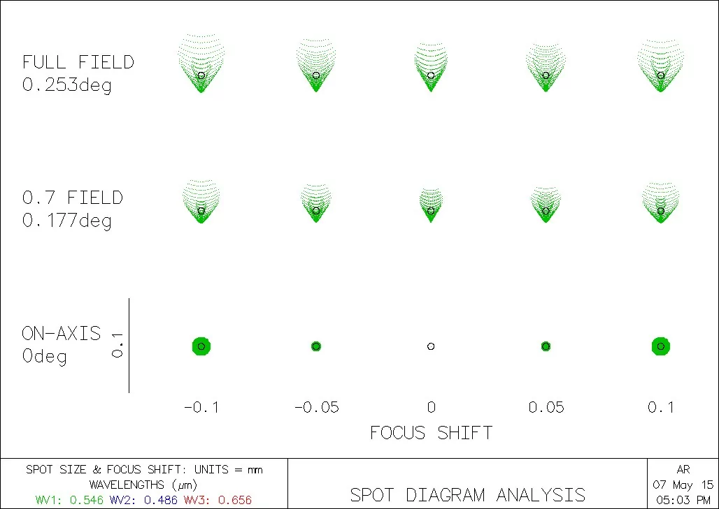
If you look carefully at the spot diagram above, you may see a small black circle. That’s the Airy disk, which represents the diffraction limit for an optical system. That’s the smallest spot size assuming a perfect lens. If your spot diagram is within that black circle, you may assume that final spot will be that of the airy disk.
Common Misconceptions and Errors in Interpreting Spot Diagrams
Understanding and interpreting spot diagrams is crucial for assessing optical system performance accurately. However, several common misconceptions and errors can lead to misinterpretations.
One prevalent misconception is the belief that larger spot sizes always indicate poor system performance. While larger spots can indeed be indicative of aberrations, it’s essential to consider the context. In some cases, a slight enlargement of spots might be permissible, especially in systems designed for specific applications where diffraction-limited performance is not a strict requirement. Misjudging the significance of spot size variations without considering the application-specific tolerances can lead to unnecessary and potentially counterproductive optimization efforts.
Another common error is the oversimplification of spot diagrams to a single metric, such as spot size alone. Optical systems are complex, and spots represent a multitude of rays converging onto the image plane. Focusing solely on spot size may overlook other aberrations or asymmetries present in the diagram. The shape and distribution of spots should be considered collectively to gain a comprehensive understanding of the optical system’s behavior.
Misunderstanding the influence of diffraction on spot diagrams is also a frequent error. Diffraction places fundamental limits on the achievable spot size based on the aperture size. Expecting diffraction-limited performance in all scenarios, especially for systems with large apertures, is unrealistic. Distinguishing between the effects of diffraction and other aberrations is crucial for setting realistic performance expectations and optimizing systems effectively.
Additionally, some may overlook the impact of wavelength-dependent aberrations. Spot diagrams often consider specific wavelengths, and changes in the refractive index with wavelength can introduce chromatic aberrations. Ignoring wavelength dependencies can lead to incomplete assessments of system performance, particularly in applications sensitive to color fidelity.
Lastly, an error commonly made is assuming that spot diagrams alone provide a comprehensive evaluation of image quality. While spot diagrams offer valuable insights, they represent a simplified two-dimensional representation and may not fully capture the complexities of three-dimensional imaging. Integrating additional metrics, such as modulation transfer functions and encircled energy, provides a more holistic assessment of optical system performance.
Conlusion
In summary, spot diagrams are a graphical tool used to evaluate the image quality of an optical system. They are created by tracing a bundle of rays through an optical system and plotting the position and size of each spot on a diagram. By analyzing the distribution of spots on the diagram, it is possible to evaluate the image quality of the optical system and identify areas for improvement.
Spot diagrams are a fast and easy way to evaluate the image quality of an optical system. They should however be used in combination with other tools to provide a complete image analysis.
Spot Diagram Insights: Frequently Asked Questions
What is a Spot Diagram in optics?
A Spot Diagram is a graphical representation used in optics to analyze the performance of a lens or optical system, showing how light focuses on a target plane.
How can Spot Diagrams be used to evaluate lens quality?
Spot Diagrams are used to evaluate lens quality by illustrating aberrations and deviations in the focal point, helping in assessing the precision of optical systems.
What are common aberrations visible in Spot Diagrams?
Common aberrations visible in Spot Diagrams include spherical aberration, astigmatism, and chromatic aberration, each affecting image clarity and focus.